

Description
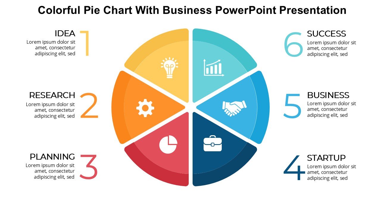
The Colorful Pie Chart With Business PowerPoint Presentation PPT template is a meticulously designed slide template that serves as a robust visual tool for educators, business professionals, and advocates who need to present complex data in an accessible and engaging format. This PPT template is specifically crafted to enhance the delivery of statistical business data through the use of vibrant, eye-catching pie charts that simplify data interpretation and capture audience attention effectively.
Ideal for a wide range of presentations, from academic lectures to business meetings, the Colorful Pie Chart With Business PowerPoint Presentation slide template helps presenters convey their points with clarity and precision. Whether you’re a teacher illustrating market share for an economics class, a business analyst reporting on quarterly sales data, or a nonprofit advocate showcasing fund allocation, this presentation template offers a polished way to display quantitative information.
The use of colorful pie charts not only aids in the visual differentiation of data segments but also enhances the overall aesthetic of the presentation, making it more appealing to the audience. The template is structured to support data-driven storytelling, enabling presenters to weave narrative around their data points effectively. Each slide within the PPT template is designed for clarity, with ample space for annotations and supplementary text, ensuring that each piece of information is both standalone and part of a cohesive whole.
The Colorful Pie Chart With Business PowerPoint Presentation PPT slide is not just about aesthetics; it is about making data approachable and understandable, turning abstract numbers into visual stories that resonate with any audience. It is a vital resource for anyone looking to make an impact with their presentations.
Features:
– Fully editable templates: Customize every element of the slides with ease.
– Vibrant color schemes: Designed to catch and hold the audience’s attention.
– Data-driven layouts: Specifically crafted for statistical representation.
– Easy to import data: Quickly add your data to the charts.
– High-resolution graphics: Ensures that visuals remain sharp and engaging in large displays.
– Compatible with PowerPoint and Google Slides: Works across popular presentation platforms.
– Multi-slide package: Includes different designs and configurations for variety and flexibility.
Use Cases:
– Ideal for classroom teaching on statistical analysis and data interpretation.
– Suitable for business meetings where market trends and shares are discussed.
– Effective for nonprofit presentations aiming to illustrate budget utilization or fundraising results.
– Useful in workshops or seminars focused on data visualization techniques.
– Beneficial for startups pitching to investors with data-centric approaches to market analysis.

There are no reviews yet.