

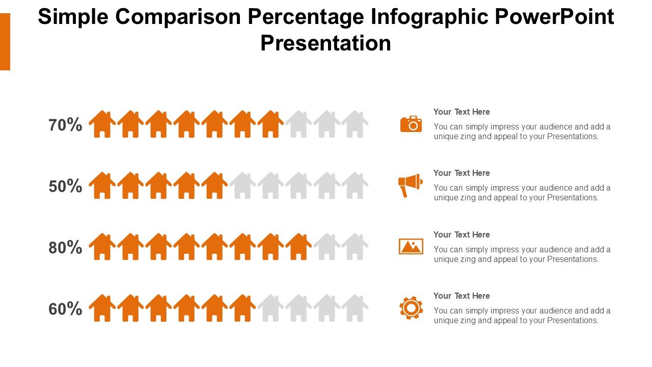
Description
The Simple Comparison Percentage Infographic PowerPoint Presentation PPT template is an expertly designed slide template that serves as a crucial resource for educators, professionals, and advocates who need to present comparative data effectively. This PPT template is crafted to help users illustrate percentages and data comparisons in a visually engaging and easy-to-understand format. Whether you are a teacher explaining statistical concepts to students, a business professional comparing quarterly sales, or an advocate presenting data to support a cause, this presentation template is tailored to meet a variety of needs.
The design of the Simple Comparison Percentage Infographic PowerPoint Presentation slide template emphasizes clarity and precision. It utilizes clean lines, balanced color palettes, and intuitive layouts to ensure that your data stands out and your message is conveyed without ambiguity. Each slide in the template is structured to facilitate the comparison of percentages in a straightforward manner, making it easier for your audience to grasp complex information quickly.
The versatility of this PPT slide template makes it an indispensable asset in any professional toolkit. It’s not only functional but also aesthetically pleasing, which enhances the overall impact of your presentation. By using the Simple Comparison Percentage Infographic PowerPoint Presentation PPT template, you can create presentations that are not only informative but also engaging, thereby increasing the retention of information among your audience.
Moreover, this presentation template is designed to be user-friendly. It allows for quick edits and customization, enabling users to adapt each slide to fit their specific content requirements and branding needs. Whether you are looking to compare financial ratios, academic results, or social statistics, this PPT template provides a solid foundation for delivering your data with clarity and impact.
Features:
– Fully editable templates: Customize every element of the slides with ease.
– High-quality graphics and visuals: Ensures that your presentation looks professional.
– Versatile slide designs: Suitable for a variety of comparison and data visualization needs.
– Easy to adapt and personalize: Insert your data quickly and adjust the layout as needed.
– Compatible with PowerPoint and Google Slides: Works across popular presentation platforms.
Use Cases:
– Utilized by educators for teaching statistical concepts and data interpretation.
– Employed by business professionals for financial presentations and market analysis.
– Used by healthcare professionals to compare health statistics and treatment outcomes.
– Suitable for non-profit organizations to present data on social issues and impact assessments.
– Ideal for environmental scientists and researchers to showcase comparative studies and findings.
The Simple Comparison Percentage Infographic PowerPoint Presentation PPT template is your go-to choice for making data comparisons not only insightful but also visually compelling.


There are no reviews yet.