


Description
The Free Comparison Chart PowerPoint Presentation PPT template is an essential resource for educators, professionals, and advocates looking to clearly present comparative data and analyses. This slide template provides a structured and visually appealing way to display comparisons between different sets of data, variables, or groups. Whether you’re in an academic, corporate, or non-profit environment, this PPT slide enables effective communication of complex information in an easily digestible format.
This PPT template is meticulously designed to cater to a wide range of users. Educators can utilize these slides to illustrate differences in educational strategies, learning outcomes, or student performance. Business professionals may find it particularly useful for comparing product features, market competition, or financial metrics. Advocates and non-profit organizations can leverage this presentation template to advocate for their causes by comparing social, environmental, or economic impacts.
The Free Comparison Chart PowerPoint Presentation slide template includes various design options to suit different presentation needs. The templates are crafted to be intuitive and user-friendly, allowing even those with minimal graphic design experience to create professional-looking presentations. The design is clean and modern, emphasizing clarity and readability to ensure that your audience can focus on the data without distractions.
Using this free PPT slide, presenters can customize the charts to reflect their branding or specific presentation style. The flexibility of this presentation template makes it an indispensable tool for anyone who needs to make comparative analyses central to their message. This template not only simplifies the creation process but also ensures that the end results are polished and impactful.
Features:
– Fully editable templates: Customize every element of the slides with ease.
– Compatible with PowerPoint and Google Slides: Works across popular presentation platforms.
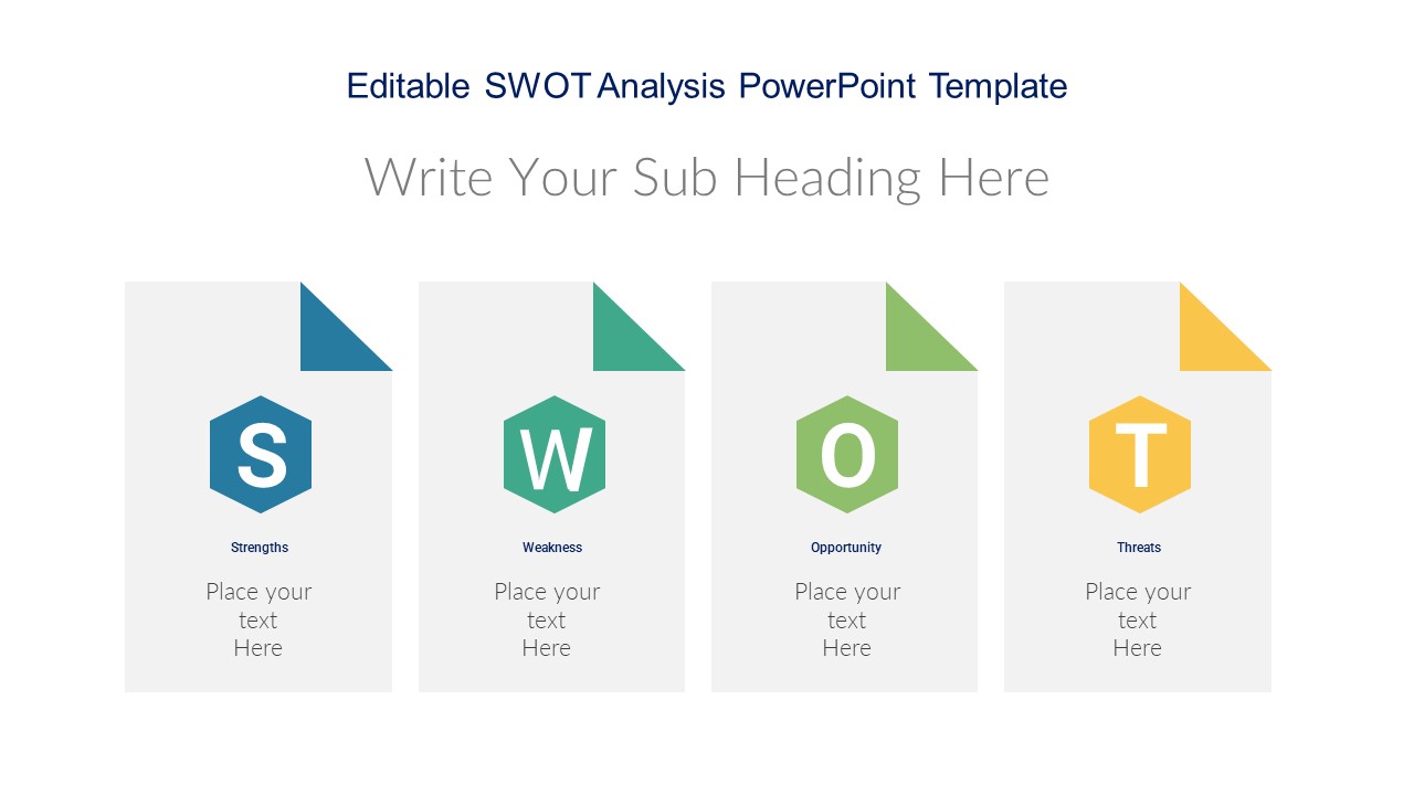
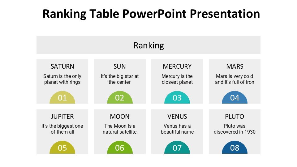
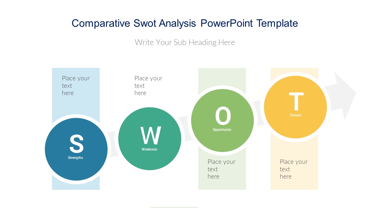
– Variety of chart types: Includes bar charts, pie charts, and line graphs to suit different data comparison needs.
– High-quality visuals: Ensures that presentations look sleek and professional.
– Multi-purpose design: Suitable for educational, professional, or advocacy-related presentations.
– Easy to navigate: User-friendly layout that makes editing and presenting straightforward.
Use Cases:
– Ideal for classroom teaching on comparative politics or economics.
– Suitable for business presentations comparing quarterly sales results.
– Effective for non-profit presentations demonstrating the impact of different outreach programs.
– Useful in workshops where participants need to analyze and discuss data trends.
– Appropriate for academic conferences to compare research findings.
– Beneficial for government presentations comparing policy outcomes or demographic data.


There are no reviews yet.