

Description
The Comparative Line Chart PowerPoint Presentations PPT template is an essential resource tailored for educators, business professionals, and advocates who require a reliable and impactful way to present comparative data visually. This presentation template facilitates a clear demonstration of trends, comparisons, and data evolution over time by leveraging the power of comparative line charts embedded within PowerPoint slides.
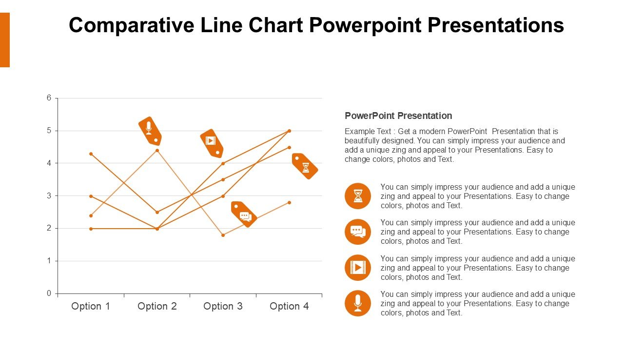
Designed to cater to a diverse range of presentation needs, the Comparative Line Chart PowerPoint Presentations slide template simplifies the process of data comparison. Whether you’re an educator aiming to illustrate historical trends to students, a business analyst presenting market research findings, or an advocate detailing the impact of policy changes over time, this PPT template is engineered to enhance your narrative with visual clarity and precision.
The user-friendly aspect of the Comparative Line Chart PowerPoint Presentations PPT template ensures that you don’t need to be a data scientist to effectively use it. With easy-to-understand layouts and customizable features, users can quickly input their data and adjust the design to fit the theme of their presentation. Each slide is crafted to not only present data but to tell a story, making your presentation engaging and memorable.
For professionals and educators, this presentation template not only serves as a visual aid but also as a tool for analysis, helping audiences grasp complex data through straightforward line chart visuals. The template’s versatility makes it an excellent choice for a wide array of applications, from academic lectures and corporate reports to advocacy and public awareness campaigns.
By integrating the Comparative Line Chart PowerPoint Presentations slide template into your presentation toolkit, you ensure that your data does not just remain numbers on a sheet but transforms into a compelling narrative supported by strong visual evidence.
Features:
– Fully editable templates: Customize every element of the slides with ease.
– High-quality graphics: Ensures that visuals are clear and impactful on all display devices.
– Versatile design: Suitable for various professional and educational settings.
– Easy to integrate data: Simplifies the process of charting complex data.
– Compatible with PowerPoint and Google Slides: Works across popular presentation platforms.
– Comprehensive user guide: Includes instructions to help new users make the most of the template.
Use Cases:
– Ideal for classroom teaching on economic trends and historical data analysis.
– Suitable for business presentations involving market trends and competitive analysis.
– Effective for NGOs in presenting statistical data to stakeholders.
– Useful for government presentations detailing policy impact over several years.
– Beneficial for scientific presentations comparing research findings.
– Excellent for workshops or seminars focusing on data interpretation and visual communication skills.


There are no reviews yet.