

Description
Introducing the Simple World Data Dashboard For PowerPoint Presentation PPT template, a meticulously designed slide template that serves as an invaluable asset for educators, business professionals, and policy advocates who need to present complex global data in an accessible and comprehensible manner. This PPT template is specifically crafted to aid in the visualization of worldwide trends, statistics, and data comparisons, making it an essential resource for those who require a reliable and efficient way to convey significant information to an audience.
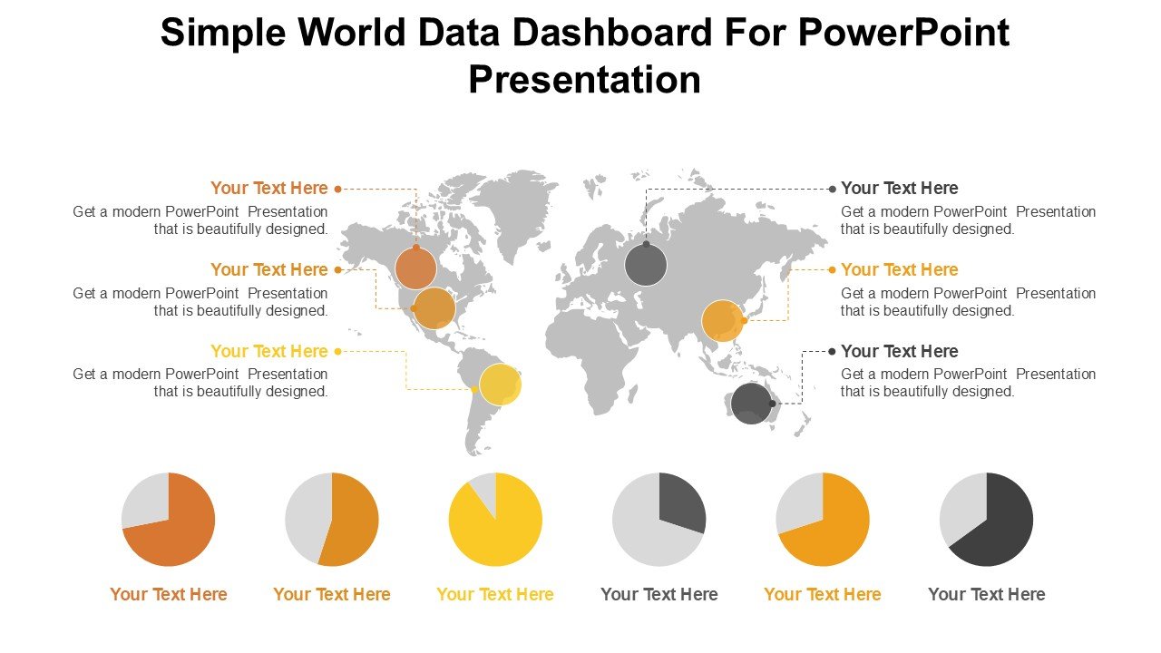
The Simple World Data Dashboard For PowerPoint Presentation slide template is not just another presentation template; it is a comprehensive toolkit designed to enhance the delivery of data-driven insights. Each slide is crafted with precision, focusing on clarity and readability to ensure that your audience grasitates the presented data without feeling overwhelmed. This PPT slide set is ideal for users looking to depict economic indicators, environmental data, population statistics, or any other form of global metrics in a visually engaging format.
Whether you are an educator illustrating global trends to students, a business analyst presenting market research findings, or a non-profit advocate sharing impact assessments, the Simple World Data Dashboard For PowerPoint Presentation PPT template provides a structured and easy-to-navigate framework for your data. Its design is clean and professional, ensuring that the focus remains firmly on the data, enhancing both understanding and retention rates among viewers.
The utility of this presentation template extends across various professional and educational settings, making it a versatile choice for anyone tasked with the job of presenting complex data sets related to global issues or trends. It is especially useful in scenarios where clear communication and precise data representation are paramount.
Features:
– Fully editable templates: Customize every element of the slides with ease.
– High-quality graphics: Ensures that visuals are clear and impactful.
– Data-driven charts and graphs: Built-in tools to help visualize statistics and metrics.
– Easy-to-follow layout: Enhances the audience’s understanding of complex data.
– Wide compatibility: Works seamlessly with Microsoft PowerPoint.
– Professional design: Suitable for corporate, educational, and advocacy settings.
Use Cases:
– Ideal for educational presentations on global demographics or economic conditions.
– Useful for corporate presentations involving international data or market trends.
– Essential for policy advocacy groups presenting data to stakeholders or policymakers.
– Beneficial for researchers and academics sharing findings in conferences or seminars.
– Suitable for NGOs reporting on global issues like climate change or health statistics.


There are no reviews yet.