

Description
**Introducing the Reporting Dashboards Visualizing Data PowerPoint Presentation**
In today’s data-driven environment, the ability to quickly interpret and act on information is paramount for successful decision-making. The Reporting Dashboards Visualizing Data PowerPoint Presentation is meticulously designed to meet the needs of professionals across various industries, aiming to communicate complex data in a visually compelling and easily understandable format.
This comprehensive PowerPoint presentation template is a perfect tool for business analysts, data scientists, marketing professionals, and anyone who needs to present data insights effectively. With a range of meticulously crafted slides, each aspect of your data can be showcased through innovative and engaging visual representations such as charts, graphs, and infographics.
**Key Features:**
1. **Fully Editable Templates:**
– Each slide is completely customizable to suit your specific needs. You can easily change colors, text, and graphics without losing quality, which ensures that your presentation aligns perfectly with your company’s branding or personal aesthetic preferences.
2. **Compatibility with PowerPoint and Google Slides:**
– Whether you are a Microsoft PowerPoint user or prefer Google Slides for your presentations, this template is versatile enough to support both platforms seamlessly. This ensures that you can create, edit, and present from any device or location without compatibility issues.
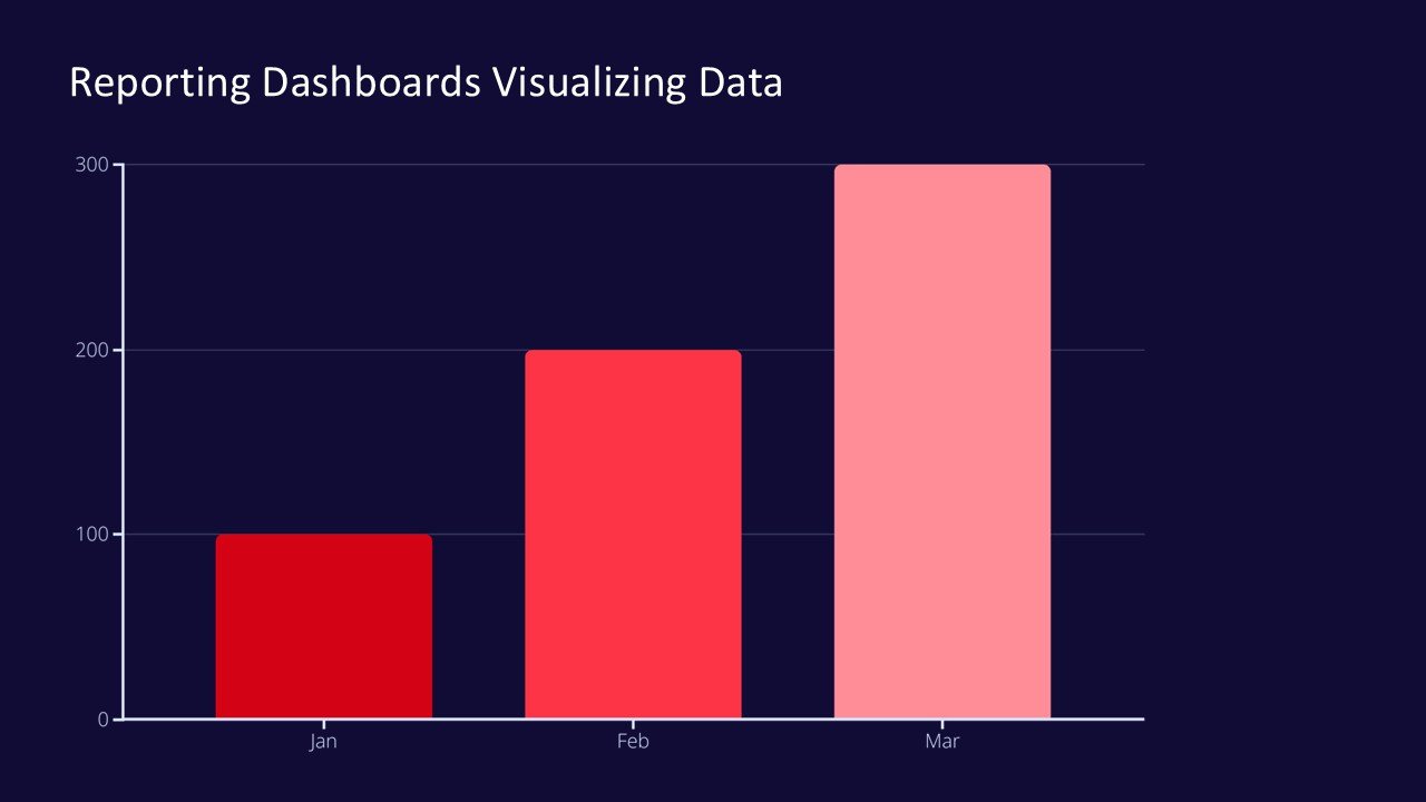
3. **Diverse Data Visualization Tools:**
– The template includes a variety of data visualization formats such as pie charts, bar graphs, line charts, and scatter plots. This diversity allows you to select the most effective way to present your data, enhancing understanding and engagement among your audience.
4. **Dynamic Layouts and Themes:**
– With multiple slide layouts and themes, you can create a dynamic presentation that keeps the audience engaged from start to finish. The clean, professional design ensures that the focus remains on your data and insights.
5. **Easy-to-Follow Organization:**
– The slides are organized in a logical flow, making it easy for your audience to follow complex data analyses and conclusions. This structured approach helps in delivering clear and impactful messages without overwhelming your audience.
6. **High-Quality Graphics and Icons:**
– The template comes equipped with high-quality vector graphics and icons that can be scaled to any size without compromising the visual quality. These graphical elements add a professional touch to your presentation, making it stand out.
7. **Support and Documentation:**
– Included with your purchase is detailed documentation that guides you through using the templates effectively, along with tips for best practices in data visualization. Additionally, customer support is available to assist with any queries you might have regarding the template.
The Reporting Dashboards Visualizing Data PowerPoint Presentation is not just a tool; it’s a game-changer for professionals who rely on data to inform and persuade. It empowers you to transform raw data into a clear, impactful narrative that can drive decision-making and showcase insights in the most effective way possible. Whether you’re reporting to senior management, collaborating with team members, or presenting at a conference, this template ensures your data presentation is as compelling as your insights.


There are no reviews yet.