

Description
The Kpi Graphs PowerPoint Template PPT template is an essential presentation template designed to assist educators, professionals, and advocates in visually communicating key performance indicators (KPIs) and other critical data. This PPT slide template is meticulously crafted to cater to the needs of business analysts, project managers, and anyone involved in performance measurement and management. Whether you’re presenting to stakeholders, students, or colleagues, the Kpi Graphs PowerPoint Template slide template ensures that your data is not only visible but also compelling.
The Kpi Graphs PowerPoint Template PPT template is versatile and user-friendly, making it ideal for a wide range of industries including education, business, healthcare, and non-profit organizations. It helps users to effectively showcase and interpret complex data through well-designed graphs and charts that highlight trends, comparisons, and performance metrics. Each slide in this presentation template is designed with attention to detail, ensuring that information is presented in a clear, concise, and visually appealing manner.
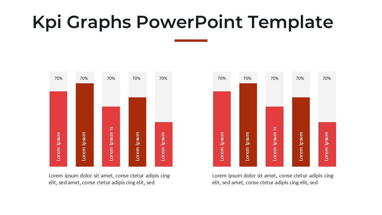
This PPT template comes fully equipped with a variety of graph styles such as bar graphs, line charts, and pie charts, each customizable to reflect specific data points and performance outcomes. The use of vibrant colors and strategic layout enhances the readability and impact of the presented data, making the Kpi Graphs PowerPoint Template slide template not just a presentation tool but a powerful communication aid.
Suitable for both seasoned presenters and those new to data visualization, the Kpi Graphs PowerPoint Template PPT template provides a solid foundation for creating presentations that are both informative and influential. It empowers users to transform raw data into understandable and actionable insights, which is critical in decision-making processes.
In summary, the Kpi Graphs PowerPoint Template slide template is more than just a presentation template; it is a comprehensive solution for effective data presentation and performance analysis. It is specifically designed to help you convey complex information in an easy-to-understand format, enhancing your ability to communicate effectively with any audience.
Features:
– Fully editable templates: Customize every element of the slides with ease.
– Wide range of graph types: Includes bar charts, line graphs, pie charts, and more.
– Vibrant color schemes: Designed to enhance visual impact and audience engagement.
– User-friendly design: Easy to use for both beginners and experienced professionals.
– High-resolution graphics: Ensures that visuals remain sharp and attractive in all settings.
– Compatibility: Works seamlessly with Microsoft PowerPoint and other popular presentation software.
Use Cases:
– Ideal for corporate presentations to showcase company performance.
– Useful in educational settings for teaching statistics and data interpretation skills.
– Applicable in non-profit organizations to report on project outcomes and impacts.
– Beneficial for government agencies during public disclosures and reports.
– Suitable for workshops and seminars focused on data management and analysis.


There are no reviews yet.