


Description
Introducing the High Low Medium Chart PowerPoint Presentation – a meticulously designed tool that empowers professionals across various industries to visualize and communicate complex data with clarity and precision. This comprehensive PowerPoint template is the perfect solution for managers, analysts, educators, and business professionals who require an effective way to categorize and display data based on priority or intensity levels.
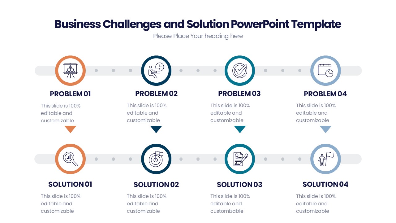
The High Low Medium Chart is ingeniously crafted to help users effortlessly illustrate the significance of different data points. Whether you’re assessing risks, categorizing project tasks, or prioritizing issues, this chart aids in clear and immediate understanding by segmenting data into three distinct categories: High, Medium, and Low. Each category is color-coded with customizable shades to enhance visual impact and facilitate quick comprehension.
This PowerPoint Presentation is not just about visual appeal; it is designed with the end-user in mind. The layout is simple yet powerful, allowing for easy insertion of data without the hassle of complicated procedures. It serves as an essential tool for meetings, reports, strategy sessions, and classroom settings, ensuring that your data stands out and delivers the intended message effectively.
**Features:**
**Fully Editable Templates**:
The High Low Medium Chart PowerPoint Presentation supports complete customization. Each element, from color schemes and text, to shapes and sizes, can be tailored to suit your specific needs. This adaptability makes it ideal for a wide range of presentations, ensuring consistency with your brand’s identity or project requirements.
**Compatibility with PowerPoint and Google Slides**:
Designed to be versatile, this template is compatible not only with Microsoft PowerPoint but also with Google Slides. This feature ensures that you can work on your presentations using your preferred platform without worrying about compatibility issues. The ease of use and flexibility provided means you can edit and present from your PC, laptop, or even on the go.
**Dynamic Visualization Capabilities**:
With the High Low Medium Chart, you get more than just static images. The charts are dynamic, allowing for real-time data updates which are essential for tracking changes over time. This makes it incredibly useful for ongoing projects where data points are continuously evolving.
**User-Friendly Design**:
The template is crafted to be intuitive and user-friendly. Whether you’re a seasoned PowerPoint user or a beginner, you’ll find the template easy to use and adjust. The straightforward design ensures that you can add your data and have a presentation-ready in minutes.
**Professional Aesthetic**:
The sleek, professional design of the High Low Medium Chart ensures that your presentation will look polished and expertly crafted. This professional aesthetic adds a level of sophistication to your presentations, enhancing your audience’s perception and engagement.
**Versatile Usage**:
From corporate boardrooms to educational classrooms, the High Low Medium Chart PowerPoint Presentation is suitable for a variety of settings. It is an invaluable tool for business presentations, academic lectures, and even personal projects where data organization and presentation are key.
Elevate your presentations with the High Low Medium Chart PowerPoint Presentation. It’s more than just a chart; it’s a versatile tool designed to make your data clear, organized, and impactful.
There are no reviews yet.