

Description
Introducing the Data Visualization: Communicating Progress Effectively PowerPoint Presentation, a sophisticated tool designed to transform complex data into clear, impactful visual stories. This premium presentation template is meticulously crafted to meet the needs of professionals across all industries who strive to present data in an understandable and visually engaging manner. Whether you’re a business analyst, project manager, marketing professional, or educator, this PowerPoint template is your ultimate solution for turning data into decisions.
At the heart of this presentation template is its emphasis on clarity and precision. With a range of slide designs that include pie charts, bar graphs, line charts, and more, you can easily tailor your presentation to the specific needs of your audience. The template’s design is sleek and professional, featuring a color palette that enhances data legibility while keeping the viewer’s attention focused on the key points you want to communicate.
Each slide in the Data Visualization: Communicating Progress Effectively PowerPoint Presentation is fully editable, allowing you to customize layouts, colors, and text to fit your specific requirements. This flexibility ensures that you can maintain brand consistency across all your presentations while adapting the template for various data sets and presentation contexts.
Further enhancing its versatility, this template supports both PowerPoint and Google Slides, making it accessible from any device and facilitating seamless collaboration. You can share your slides with team members in real-time, gather feedback, and make instant adjustments, ensuring that your final presentation is polished and compelling.
**Features of the Data Visualization: Communicating Progress Effectively PowerPoint Presentation:**
1. **Fully Editable Templates:** Every element, from text to color schemes and graphics, is customizable to suit your specific needs.
2. **Compatibility with PowerPoint and Google Slides:** Whether you prefer working in Microsoft PowerPoint or Google Slides, this template offers full functionality across both platforms, enhancing flexibility and collaboration.
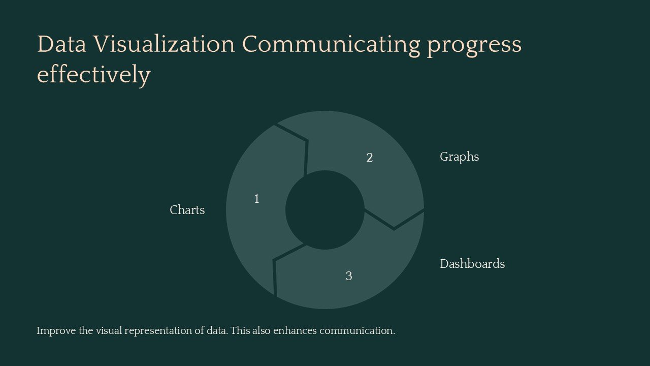
3. **Diverse Data Visualization Tools:** Includes a variety of graph and chart types to represent your data visually. Choose from pie charts, bar graphs, line charts, scatter plots, and more to communicate your message effectively.
4. **Professional Design:** The template features a clean, professional design that can be adapted to any business or educational context, ensuring your data not only stands out but is also easy to understand.
5. **Adaptable for Various Audiences:** Tailor your presentation for different stakeholders—executives, clients, colleagues, or students—with ease, ensuring that your data presentation resonates with any audience.
6. **Easy to Use:** Even those new to data visualization will find this template user-friendly, with intuitive slide layouts and design elements that make data representation accessible to everyone.
The Data Visualization: Communicating Progress Effectively PowerPoint Presentation is more than just a template—it’s a powerful tool for storytelling with data. It empowers you to convey complex information in a straightforward, visually engaging manner, ensuring your presentations not only inform but also inspire your audience. Whether presenting quarterly results, forecasting trends, or educating students on data interpretation, this template will elevate your ability to communicate effectively through visual data.


There are no reviews yet.